OneGram Organics
2026
The hands are the proof
An organic farm brand: Kadaknath eggs, cold-pressed oils, spices and vegetables. Two films, the packaging, and the system that holds the range together.
What was in it
- Brand identity
- Packaging
- Film
- Social direction
The hands are the proof
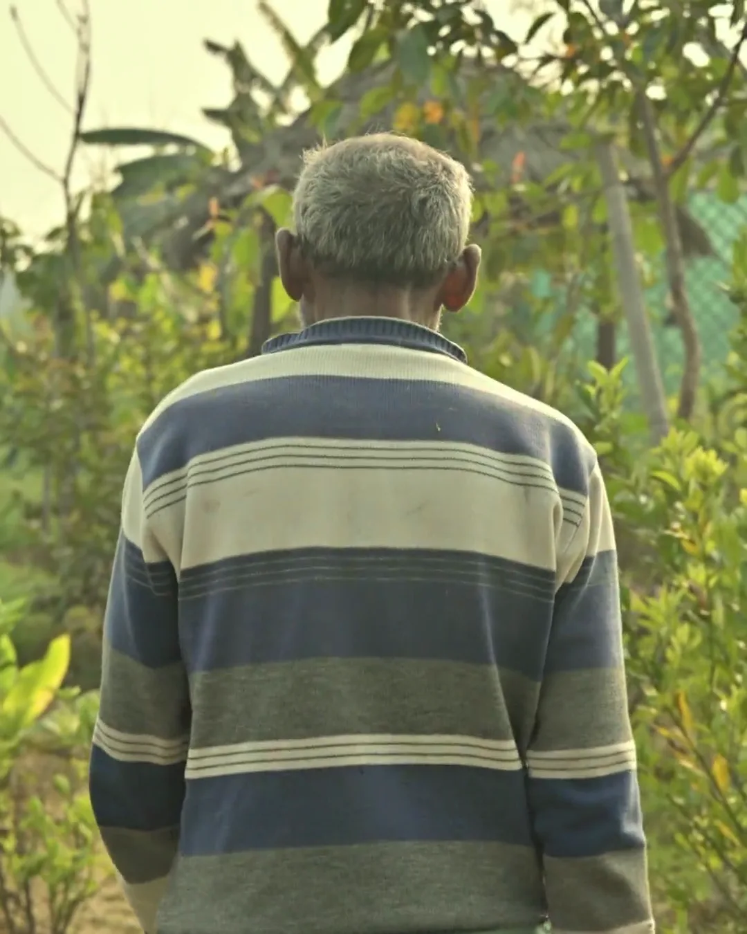
Organic is a word anyone can print on a label, so the storytelling film never says it. It shows produce washed under a running tap, a farmer crouched in the rows, and roots pulled with the soil still on them. Sixteen seconds, no voice, no claim. The evidence does it.
The range
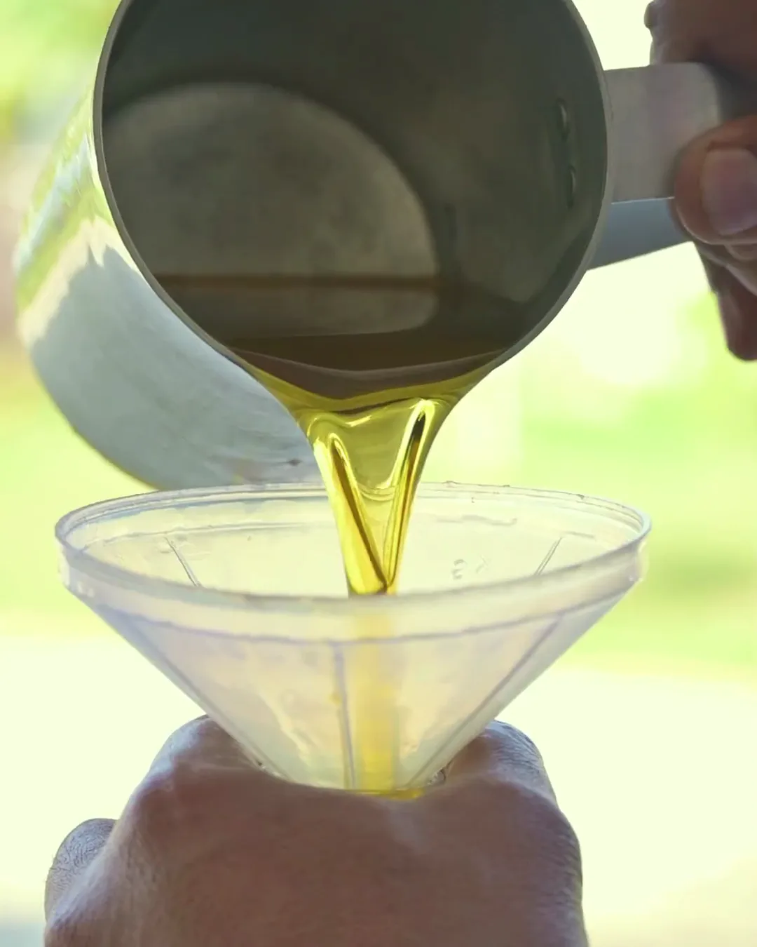
The highlight film runs the other way: oil poured thick and gold into a bottle, dried red chillies tipped into a bowl, turmeric falling in a stream, nuts by the sackful. Product shot as ingredient rather than packshot, which is what a buyer at this end of the market is actually deciding on.
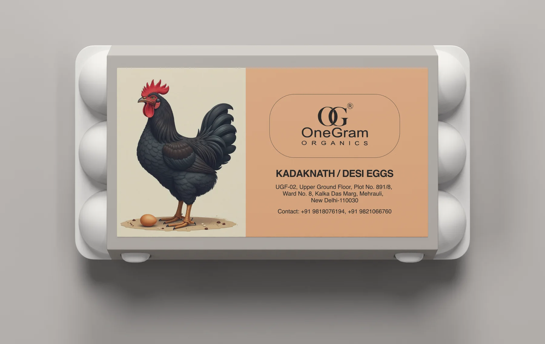
The carton
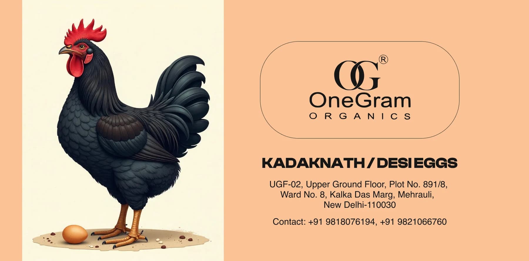
Kadaknath is a black-feathered bird, and the label leads with it: a full illustration of the bird standing over a single egg, given half the panel. In a chiller cabinet full of white cartons and stock photography, a drawing of the actual breed is the fastest way to say this is not the usual dozen.
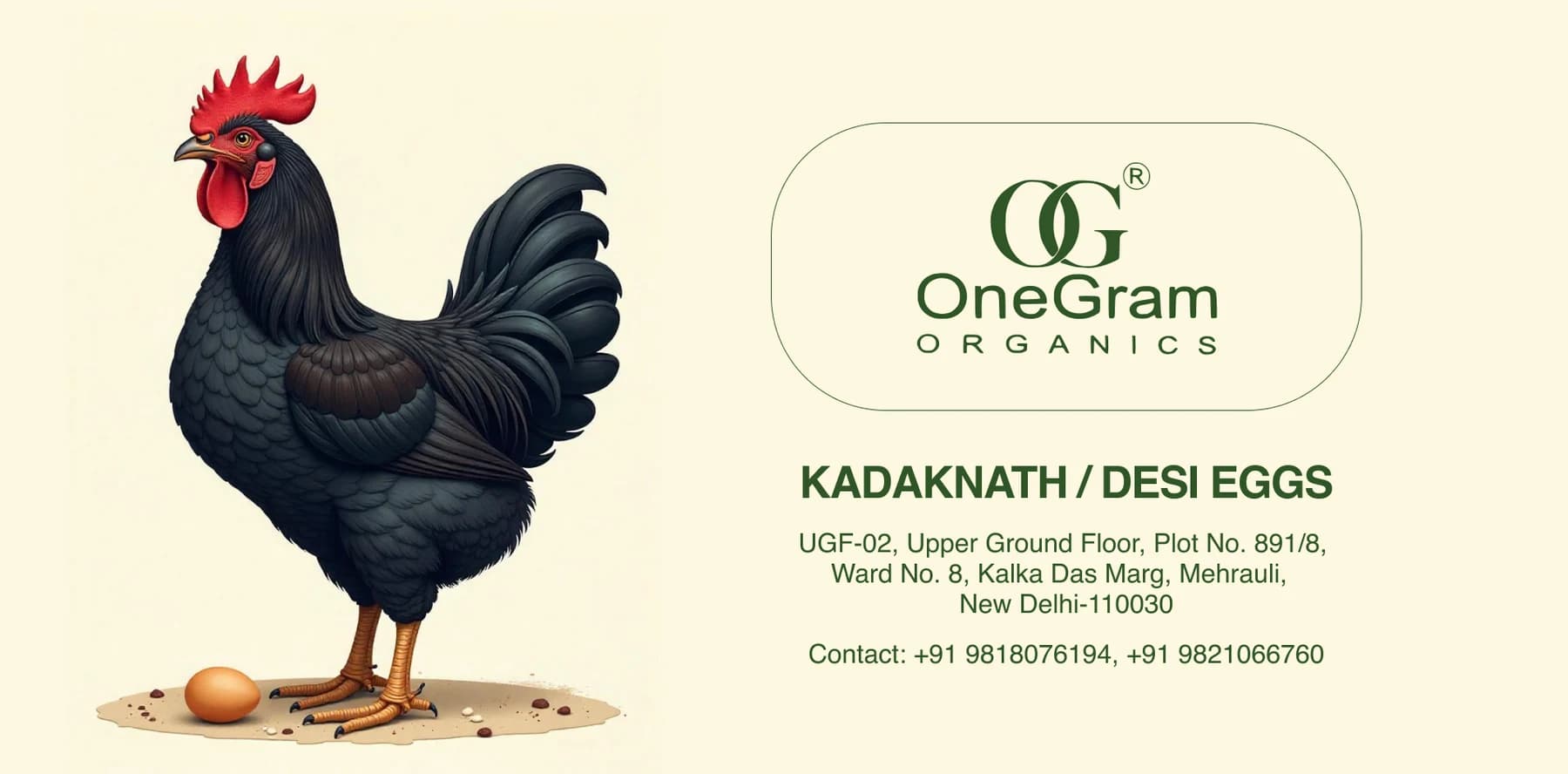
Two grounds, one label
The same artwork runs on cream with deep green type and on peach with black. One label, two grounds: enough to separate a line without redrawing anything, and enough to keep a shelf of different products looking like one brand.
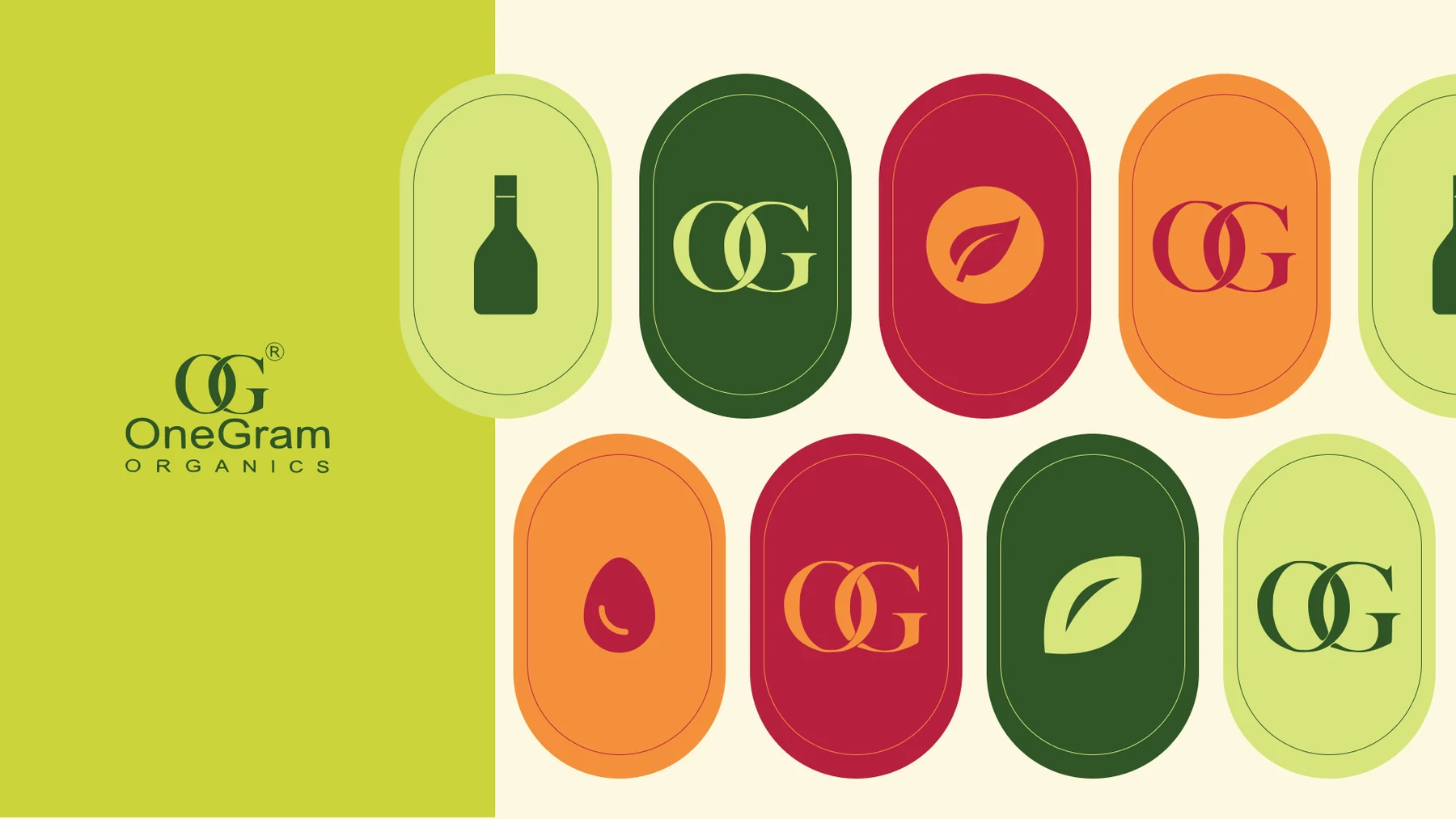
The system
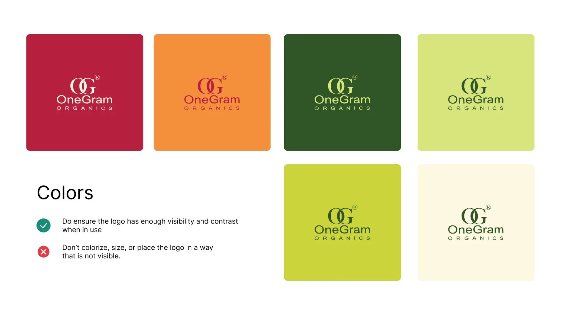
The monogram sits in a capsule, and the capsule is the unit everything else is built from: the OG mark, a bottle, a leaf, an egg, alternating across six colours. The guidelines page is blunter than most (keep the logo readable, do not recolour or crop it), which is the rule that actually gets broken once a brand is being applied by other people.