Odyssey Heritage
2026
A mark that has to survive a phone screen
A travel LLP out of Noida. Identity, the film that assembles it, and the stationery a first-time client actually sees.
What was in it
- Identity
- Brand film
- Stationery
The brand
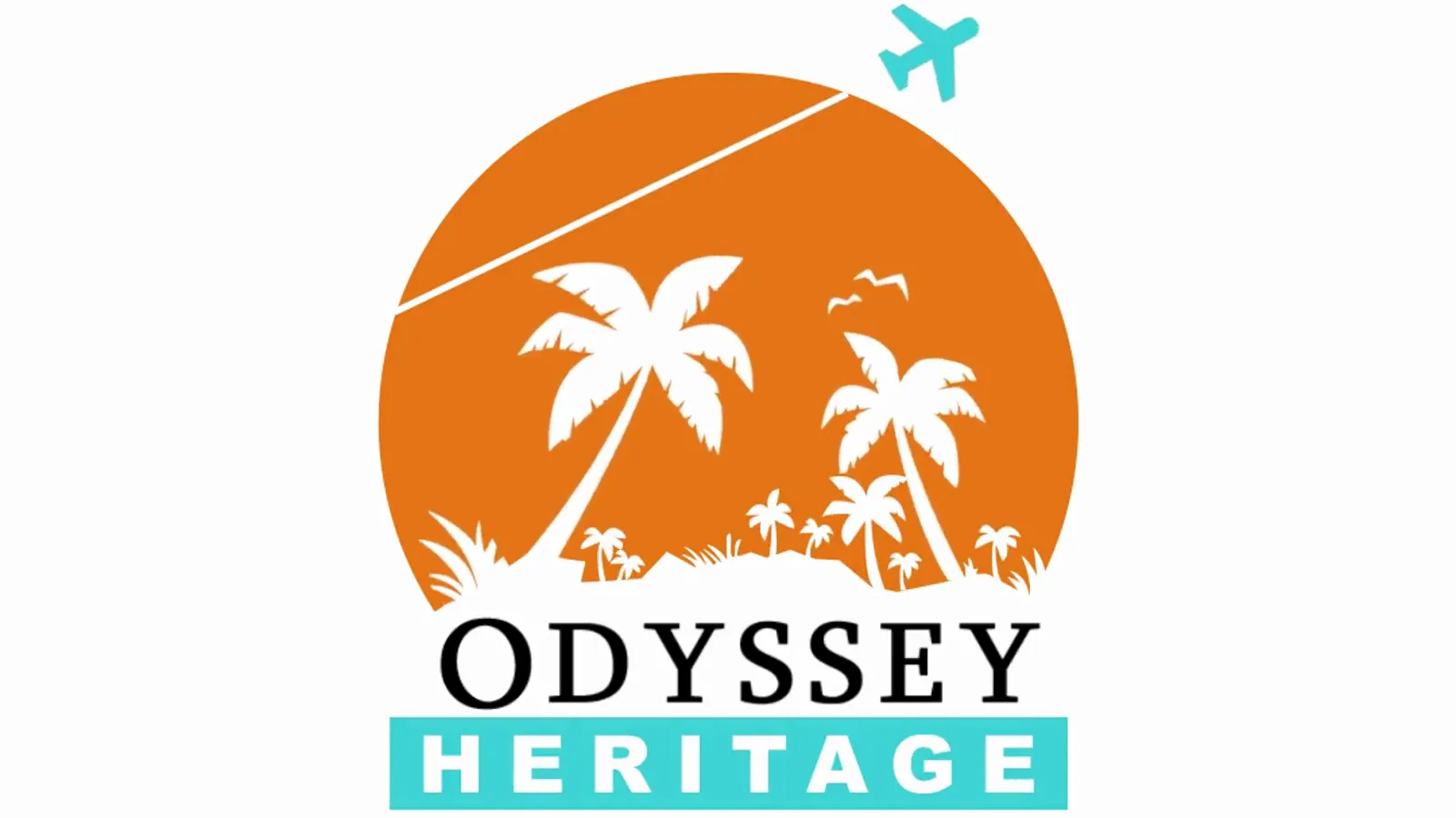
Odyssey Heritage sells travel. The mark is a sun with two palms cut out of it and a plane leaving the trail that slices the disc: a destination and the way you get there, in one shape. Orange against teal, which is a holiday brochure's palette on purpose: this is not a brand that wants to look restrained.
The film
Six seconds, and the mark builds itself: a teal ring, the wordmark drawn out by the plane, the sun rising in behind it, the lockup landing. It runs at the head of a reel and in front of a quote, the places a small travel company gets judged before anyone has read a word.
The stationery
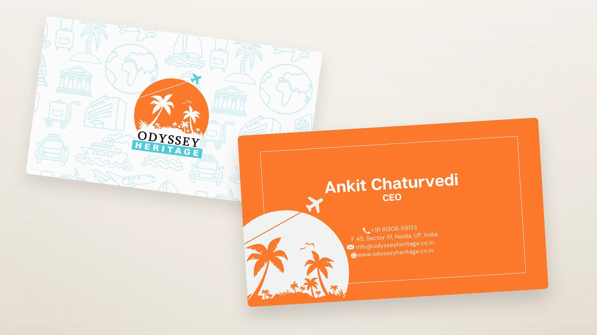
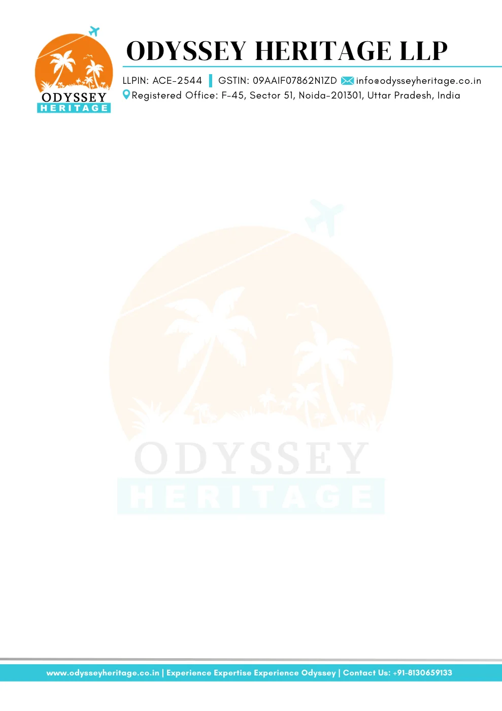
A letterhead and a card. Neither is glamorous work, and both are the first physical thing a client holds. The card runs the mark on one face and the details on the other, so the reverse can be given over to a pattern of the trade (palms, planes, ships, luggage, passports) drawn light enough to stay a texture rather than becoming a picture.