Bleubacks
2026
Structure that preceded the trend
A fashion house founded by architects, positioned against slow heritage. Identity, the colour and type system, the manifesto film, and the campaign that carries it.
What was in it
- Identity
- Art direction
- Brand film
- Campaign
- Website
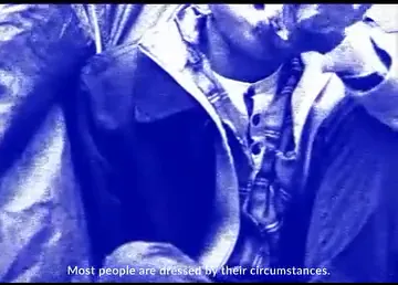
“Most people are dressed by their circumstances. We are not interested in most people.”
Bleubacks
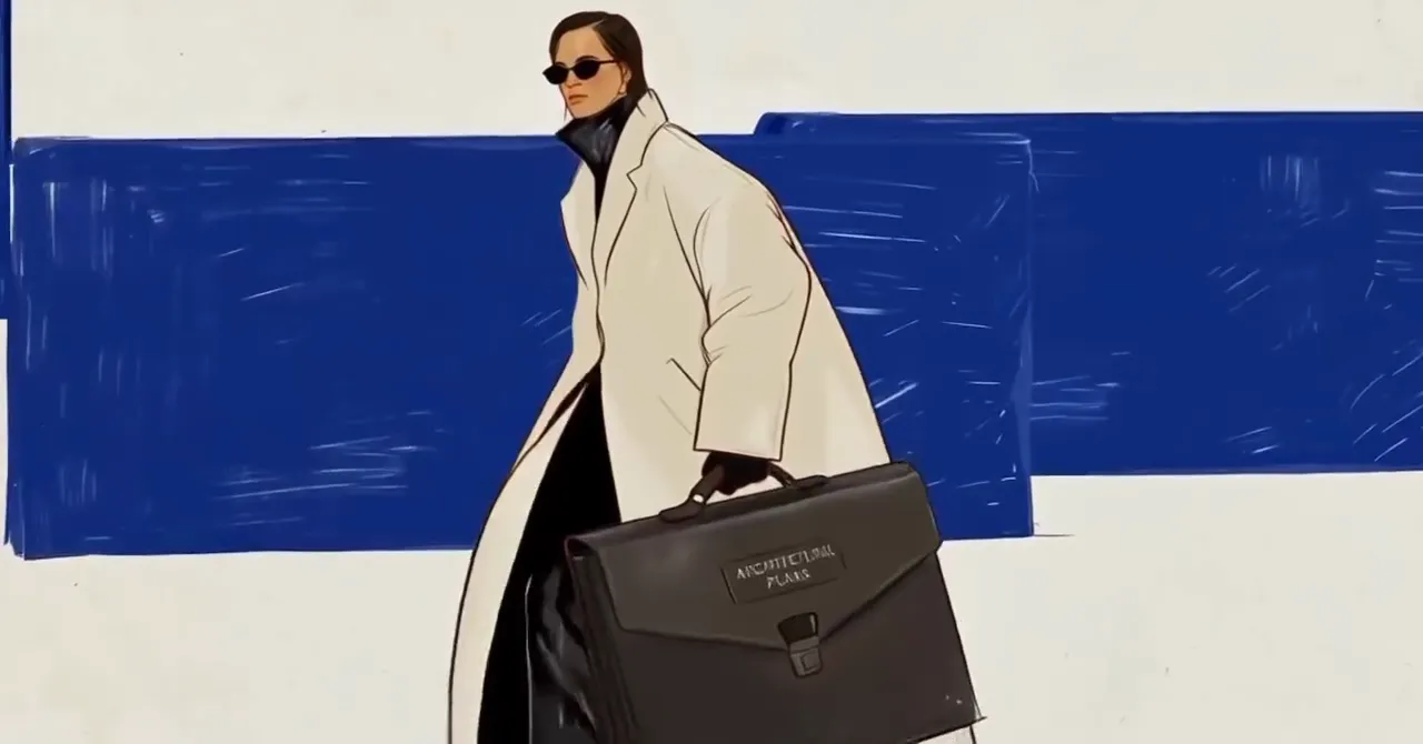
The position
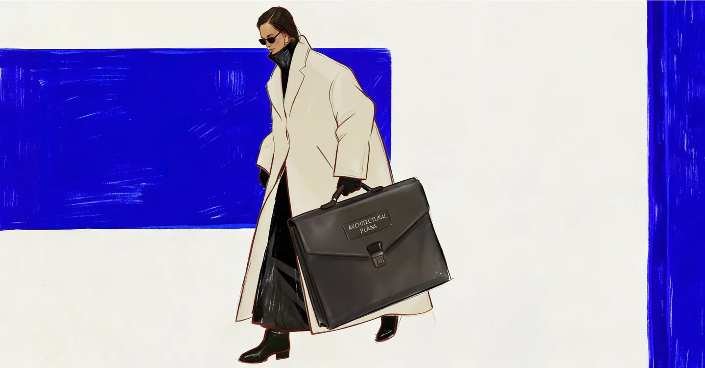
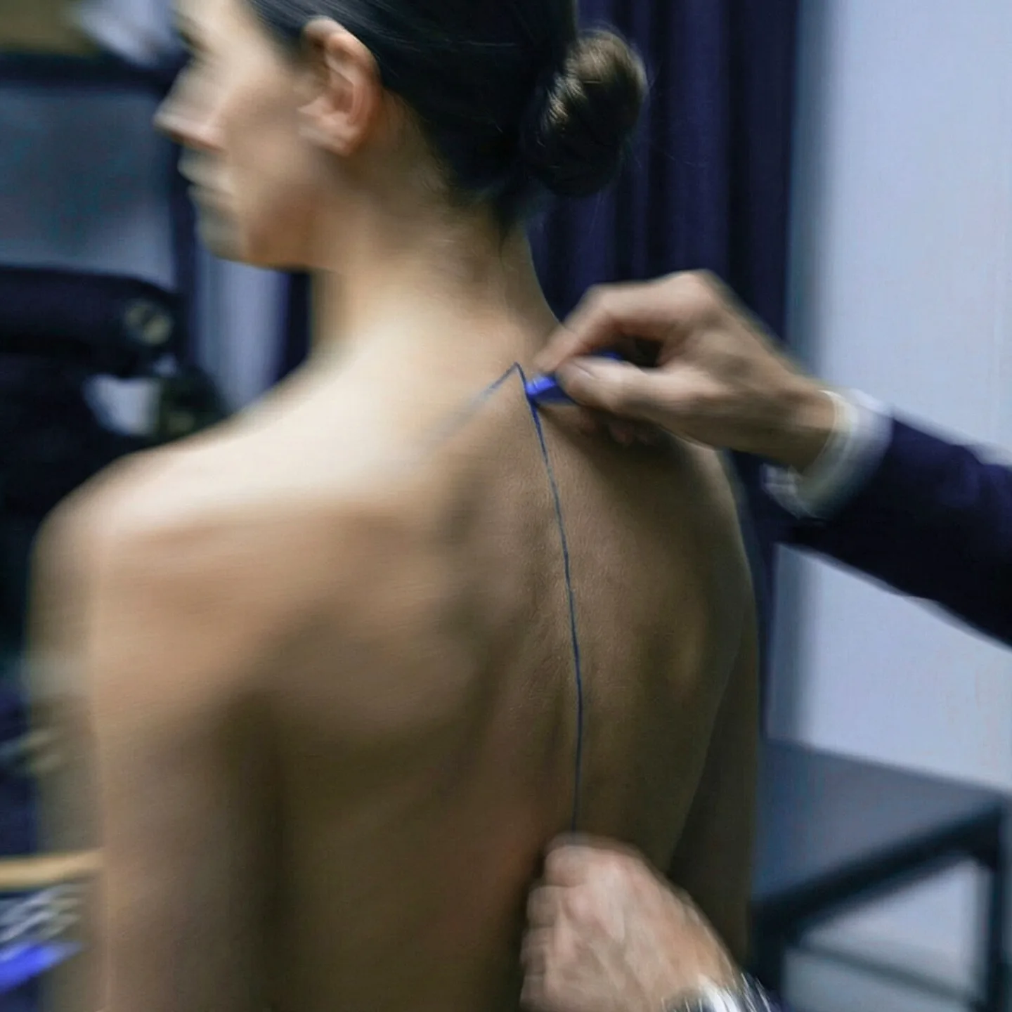
Bleubacks calls itself a Fast Luxury house. That is its own term, and the whole brand is an argument for it. Founded by architects and designers, it makes structured smart-casual for people who built their money rather than inherited it. That distinction is not something a logo can carry on its own, so most of the work went into everything around the logo: what the brand says, what colour it says it in, and who it turns down.
The mark
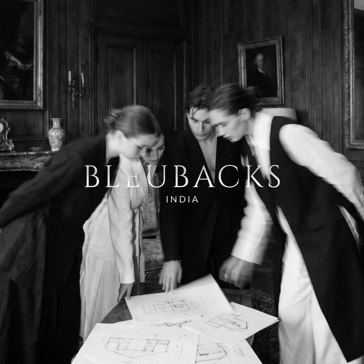
There is no symbol, only the word. Serif capitals, letterspaced wide enough that the name has to be read slowly, with INDIA set small underneath, the country stated plainly rather than tucked away, because a Fast Luxury house built in India is the argument rather than an awkward fact about it.
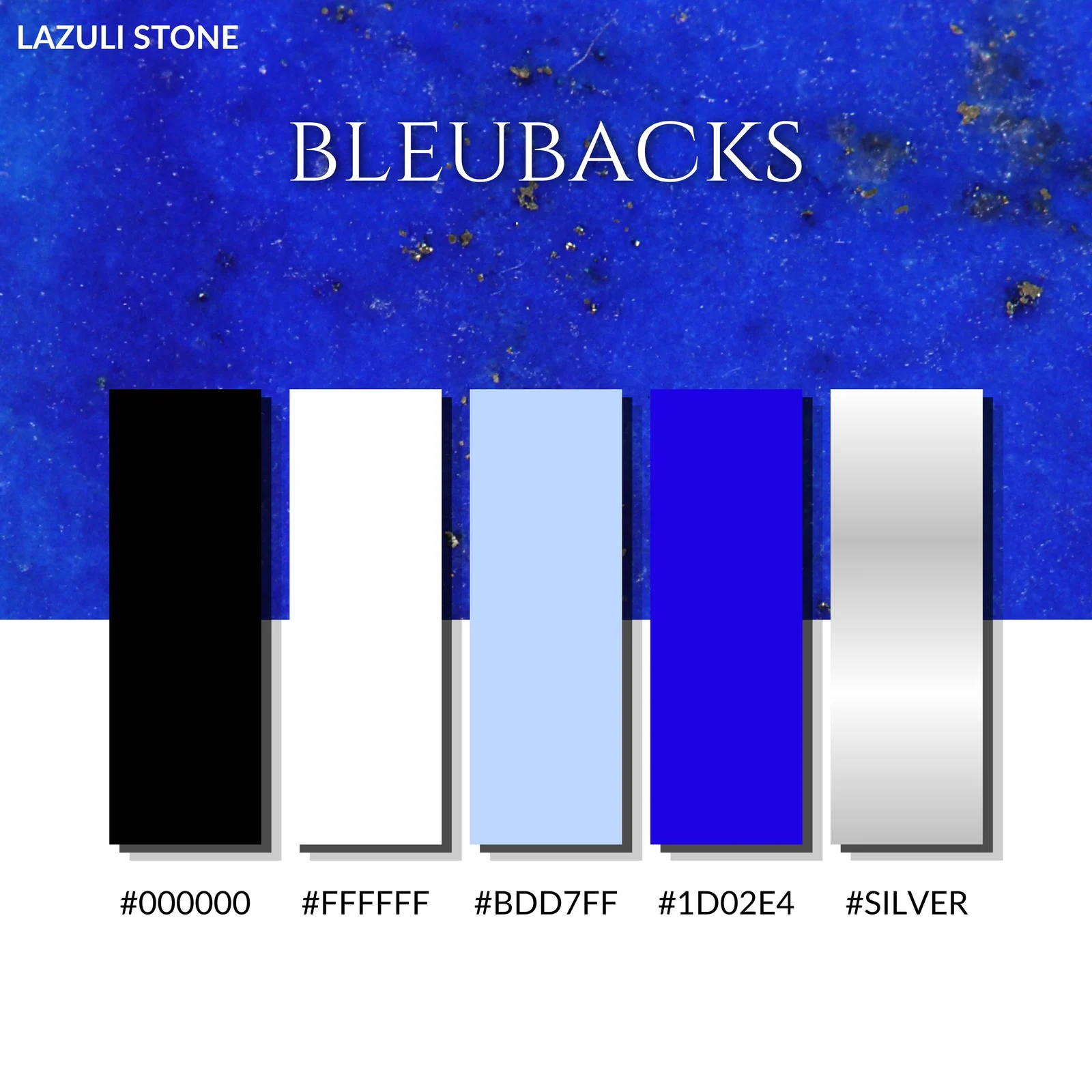
Lazuli
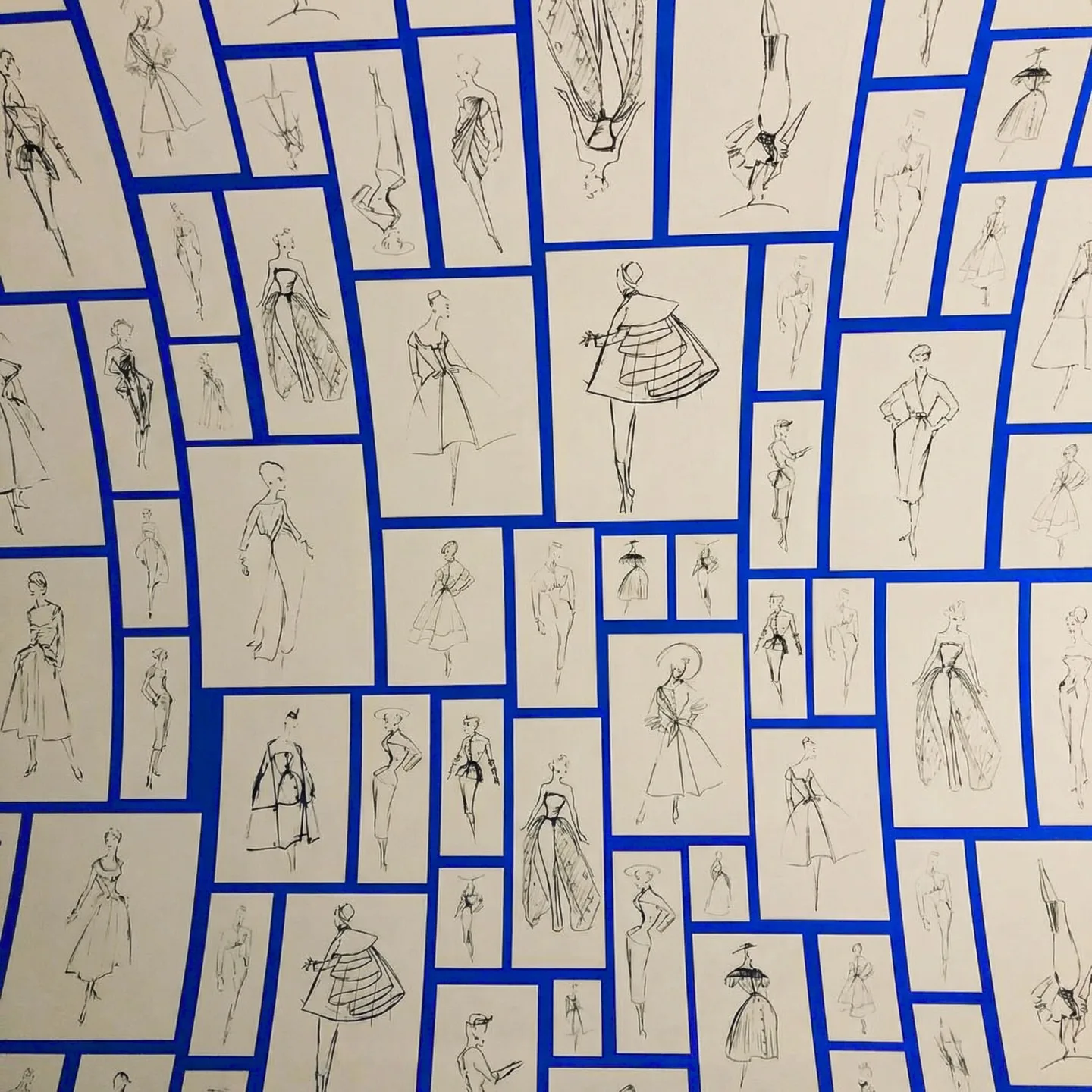
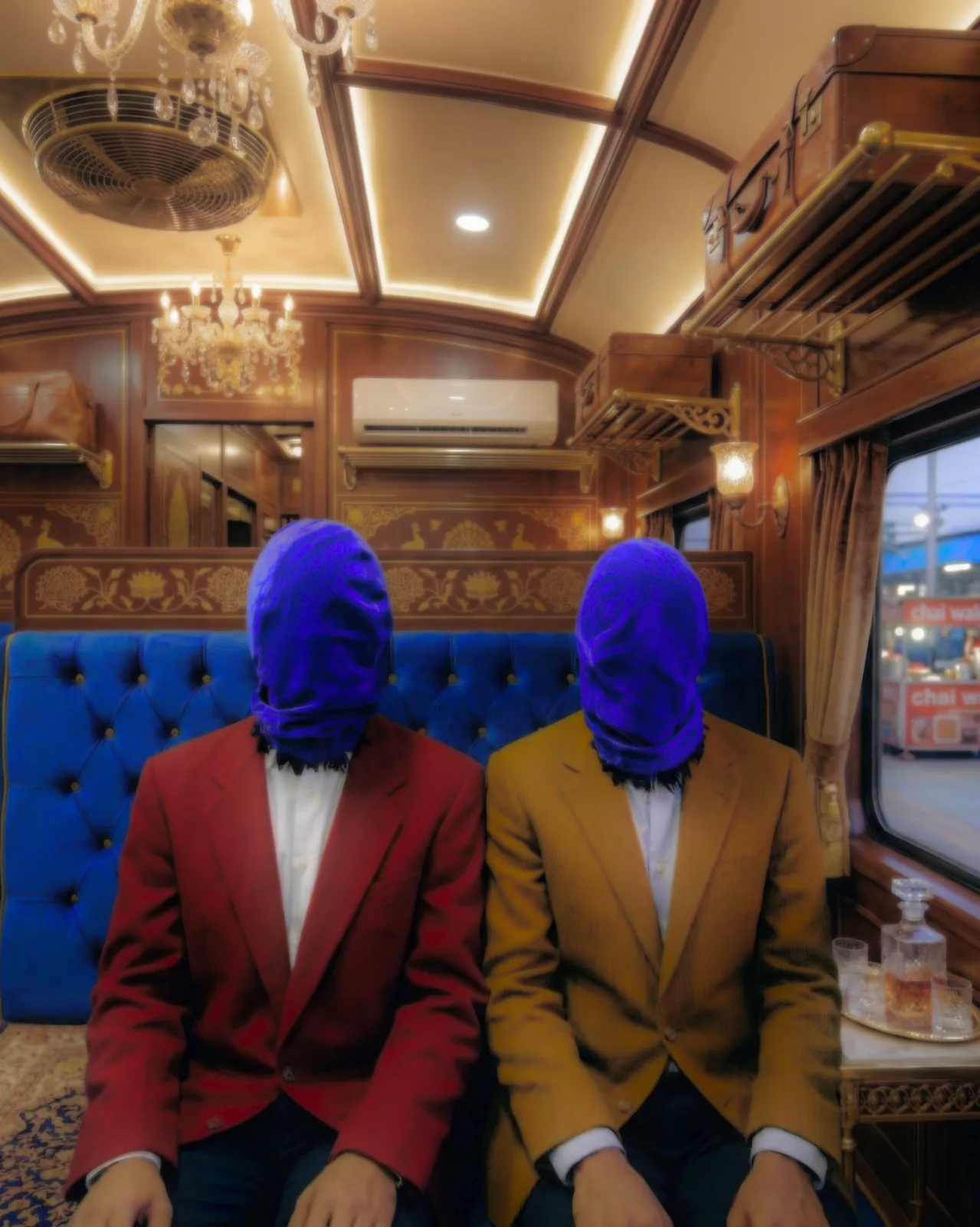
The palette is named after the stone, and it is really one colour with four supports. #1D02E4 has two parts green out of 255: a blue with almost nothing else in it, hard to print and harder to dye, which is the point. Black, white, a powder blue and silver do the rest. Nothing warm is allowed in except the suits in the campaign.
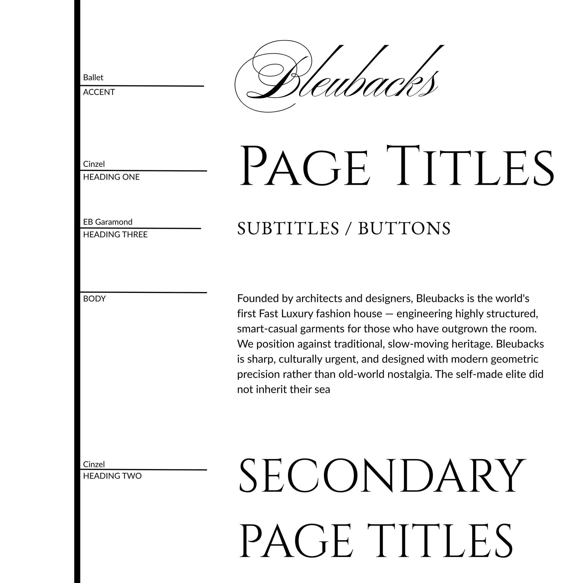
The type
Cinzel for page titles and section heads, EB Garamond under it, and Ballet (a script) held back for the accent. Three serifs, where a fashion label launching today would reach for a grotesque. It is the architecture argument again: the brand wants to read as an institution that was already here, not a label that arrived.
The manifesto
A minute of footage pushed into the one blue, with the argument typed along the bottom. It opens on “Most people are dressed by their circumstances” and ends on “Fast. Exact. Uncompromising.” There is no product in it. It is the piece that goes out first, because a founder who disagrees with the film will disagree with everything after it.
The teaser
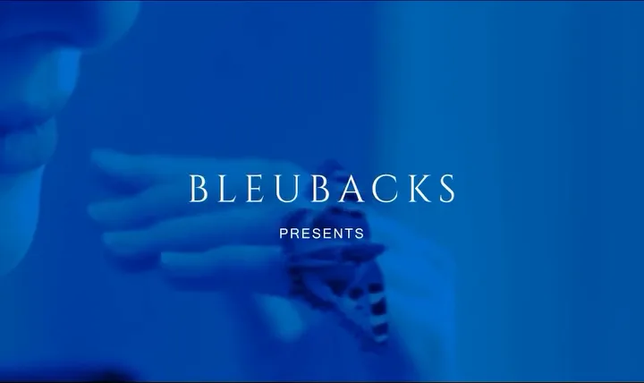
Fifteen seconds, black and white, and not one garment shown in full. It opens on a blue card reading BLEUBACKS PRESENTS and closes on the wordmark surfacing out of the dark. The manifesto film makes the argument. This one only establishes that the house exists and is not going to explain itself.
The campaign
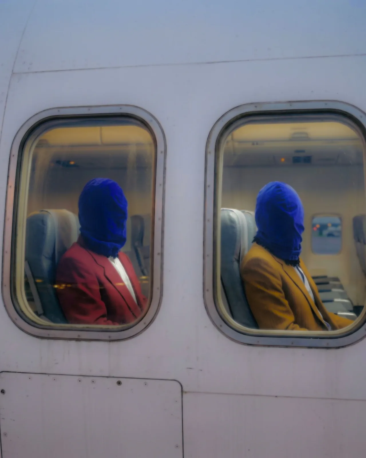
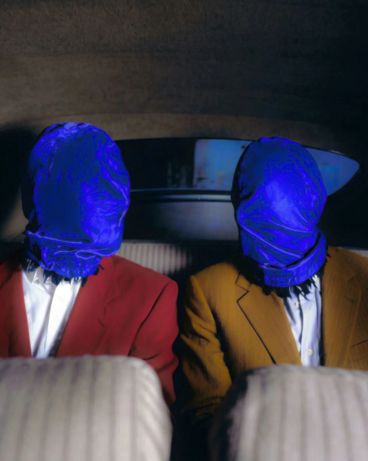
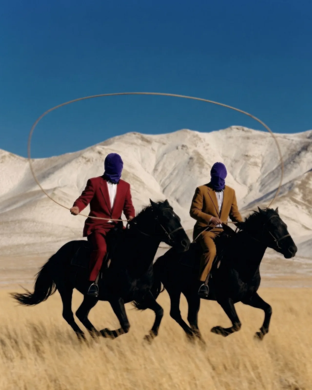
Four frames, two men, faces covered in blue. A car, a plane, a train carriage, a stretch of open country. The suits are the only warm colour the brand allows, and they are worn by people you cannot identify, which is the joke and also the pitch.
The site
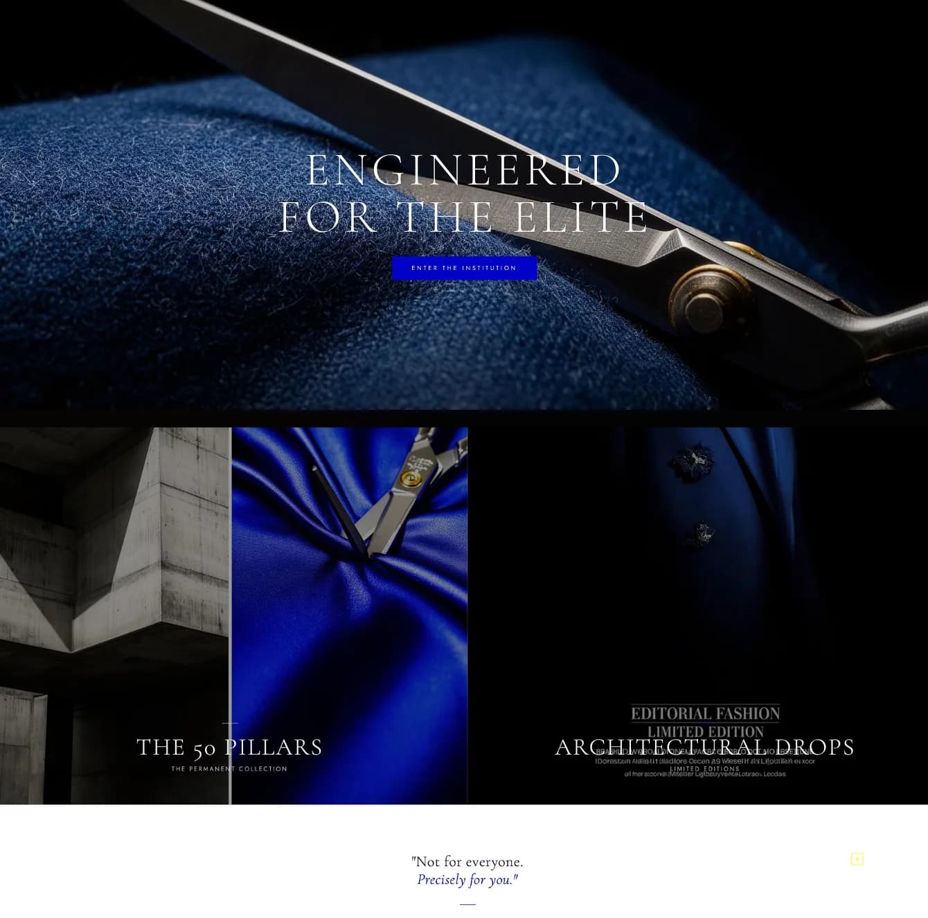
Enter the institution, not shop now. The homepage is shears on cloth and one line, and the two doors under it are the permanent collection and the drops, which is the whole commercial model stated before anything is for sale. It closes on the position rather than a product: not for everyone, precisely for you.
The plan
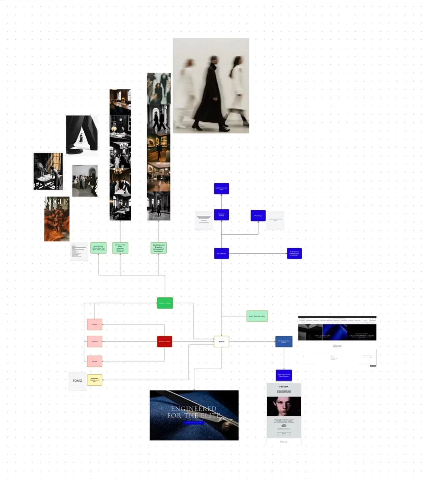
The campaign was mapped before a frame was shot: what the organic posts do, which of them get spend behind them, where PR and seeding sit, and how all of it lands on the site and turns into an email address. The board is the working document, which is why the brand did not need a new idea every month.