Baela
2026
Silver is second gold
A hallmarked 925 silver house from Shri Lal Babu Jewellers. We built the mark, the film, the photography, the writing and the box it all arrives in.
What was in it
- Identity
- Brand film
- Product photography
- Packaging
- Campaign
- Website
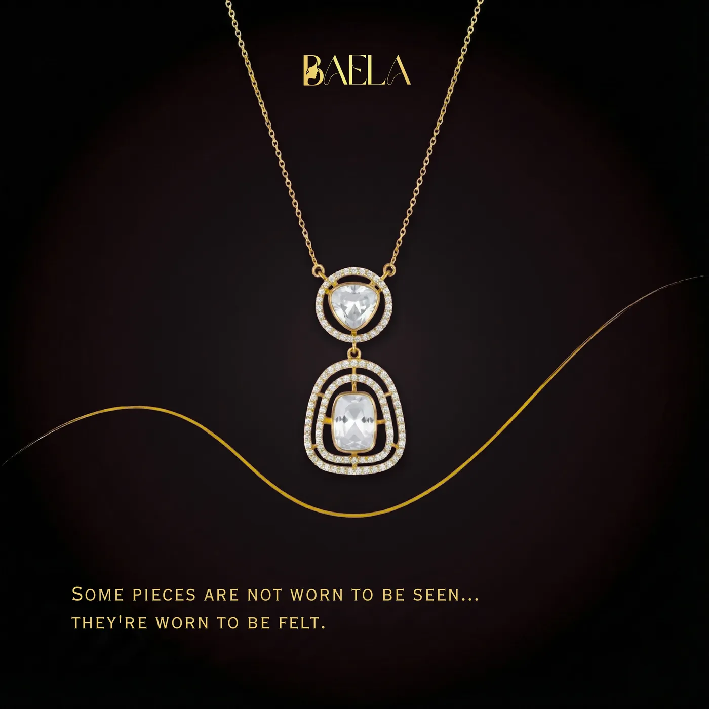
“Some pieces are not worn to be seen… they're worn to be felt.”
Baela

The brand
Baela sells hallmarked 925 silver: the everyday piece rather than the locked-away one. Its own line for that is the whole positioning in four words: silver is second gold. Priced to wear to the office and to a chai run, made well enough to sit in a trousseau years later.

The mark
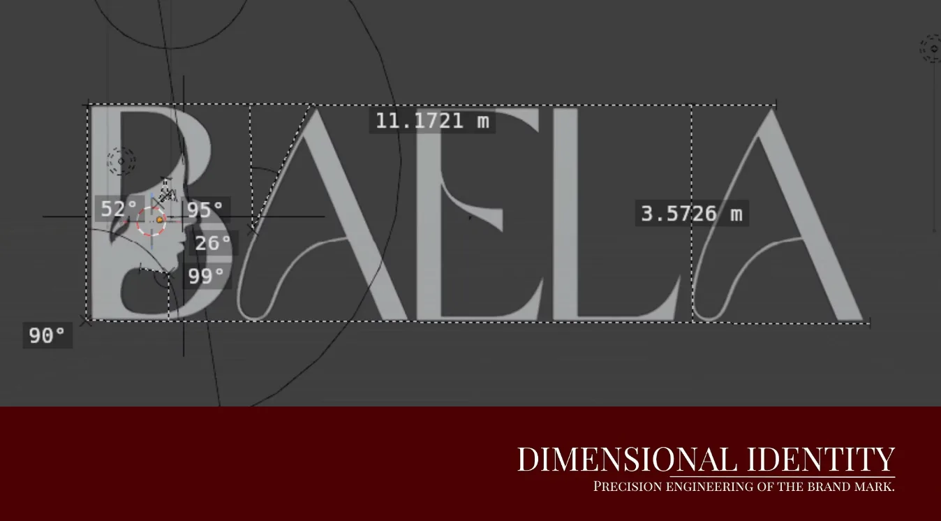
A woman's profile cut into the counter of a B, so the letterform and the face are the same shape. It reads at a jeweller's scale (small, stamped, foil-blocked), which is where a jewellery mark actually has to work. The film turns it in three dimensions and resolves it, for the storefront and the first frame of every reel.

How it was drawn
The mark was built rather than sketched. The B is a vector outline with the profile cut from its counter, held against guides so the face and the letter resolve at the same weight. It then goes into three dimensions, where the wordmark is measured rather than eyeballed: every angle and span set, so the lockup holds at a shopfront and at eleven millimetres on a hallmark. The rings are modelled the same way before a stone is chosen.
The writing
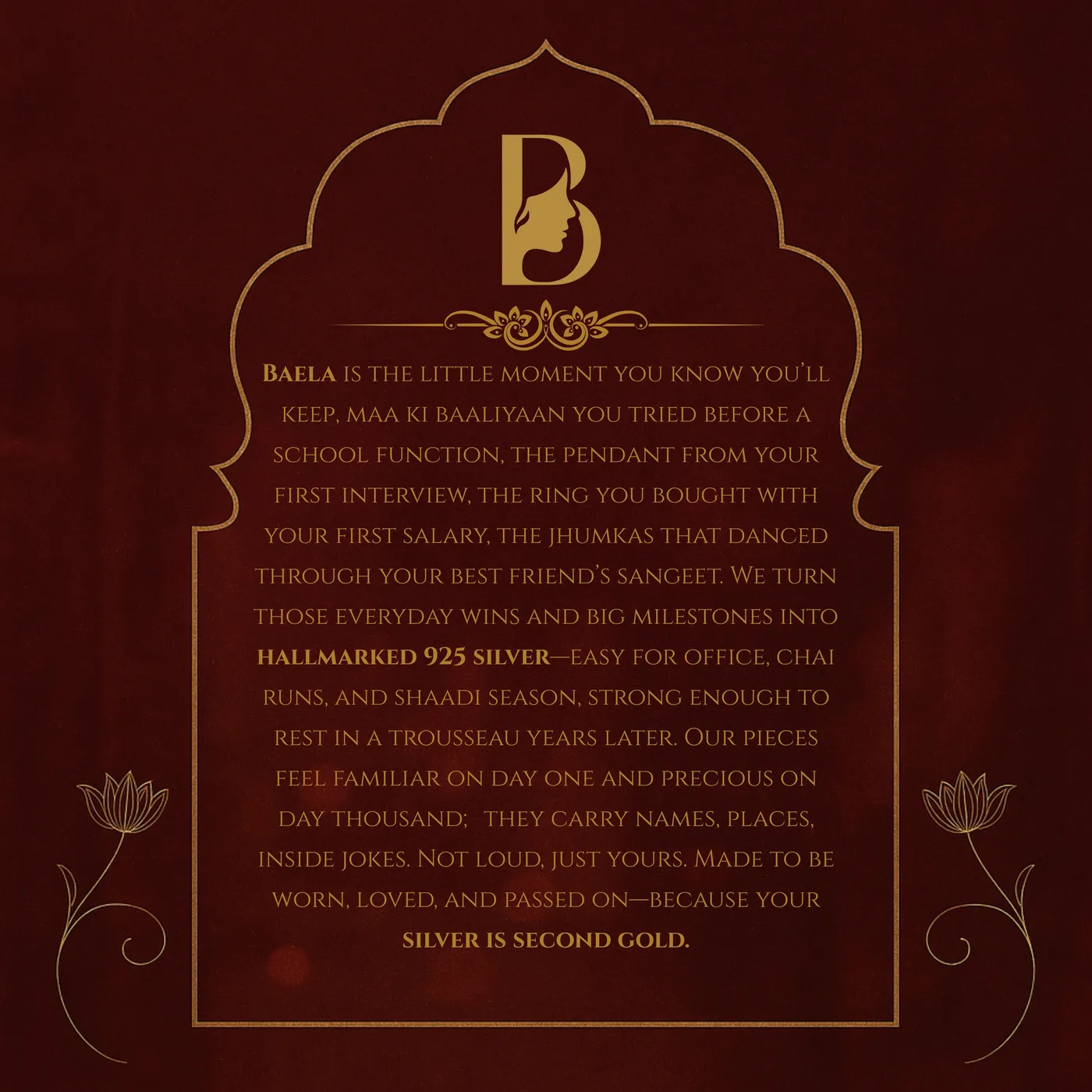
The brand statement runs down a list before it makes a claim: maa ki baaliyaan tried on before a school function, the pendant from a first interview, the ring bought with a first salary, the jhumkas that danced through a best friend's sangeet. It earns the line at the end rather than opening with it.

The photography
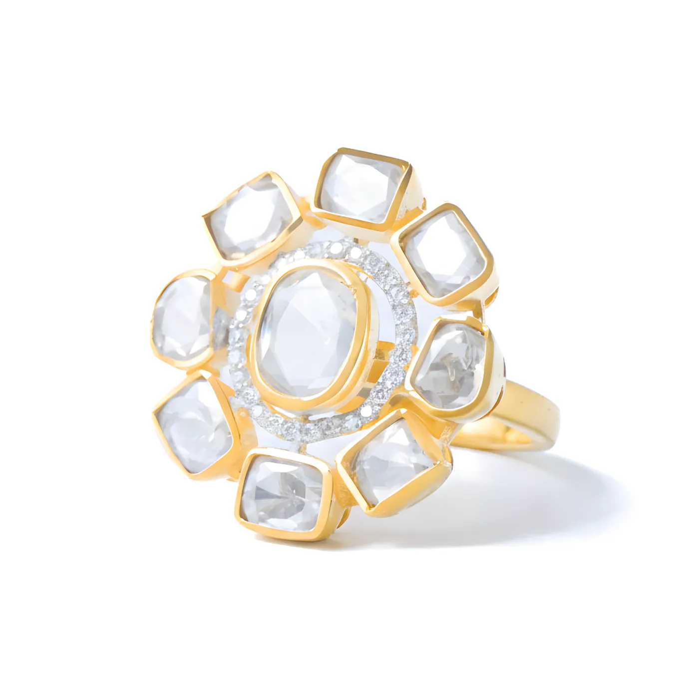
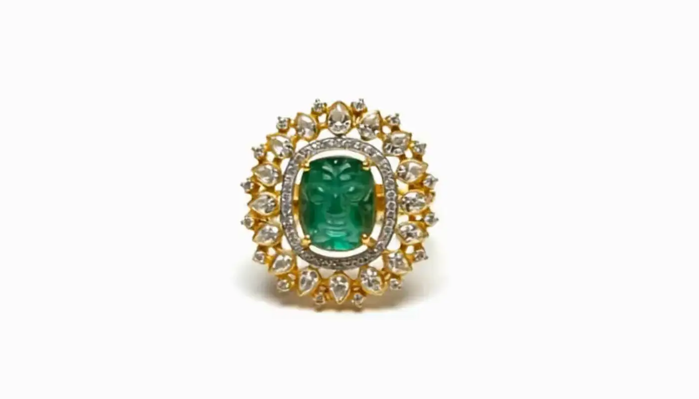
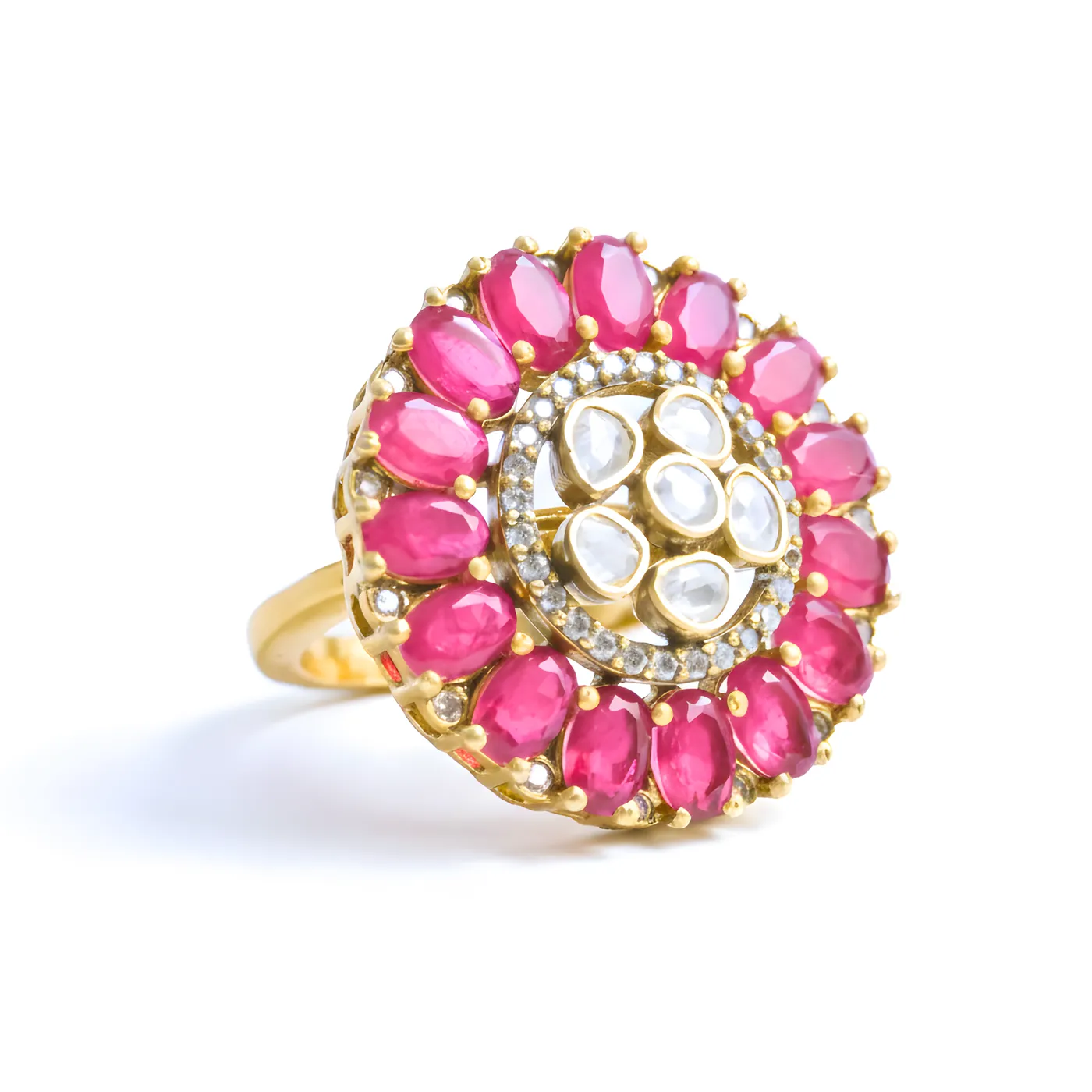
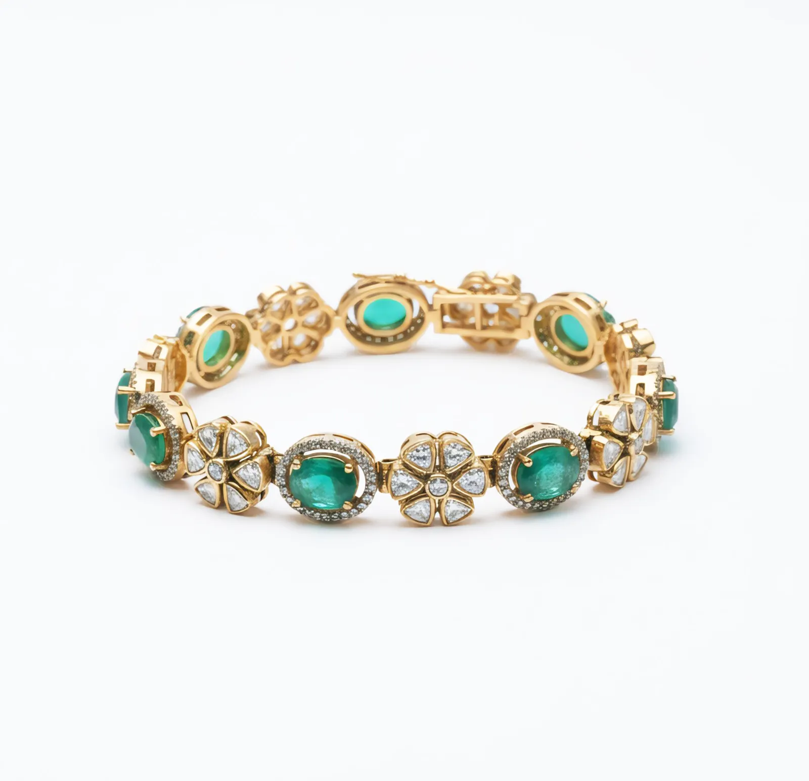
Polki and kundan on clean white, lit so the settings read and the stones keep their depth. Shot to work as a catalogue and as a feed, so the same frames carry a product page, a carousel and an ad without a reshoot.
The packaging
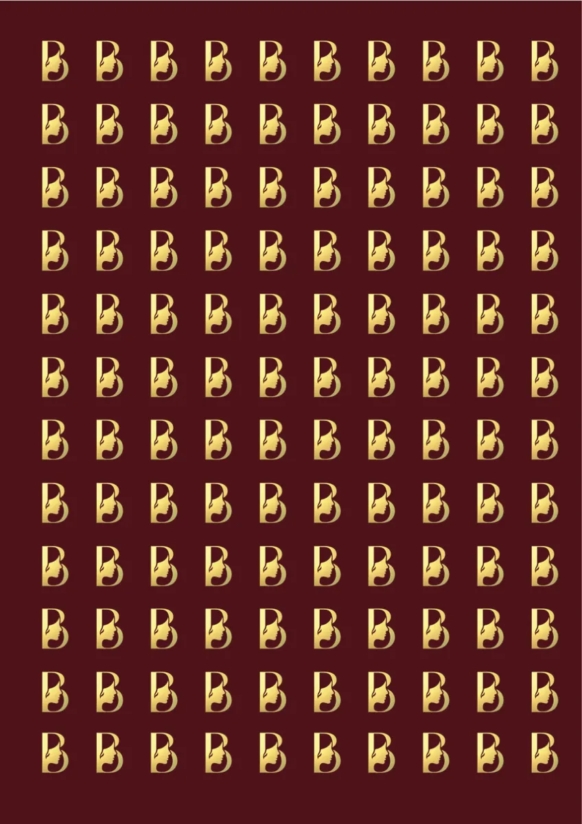
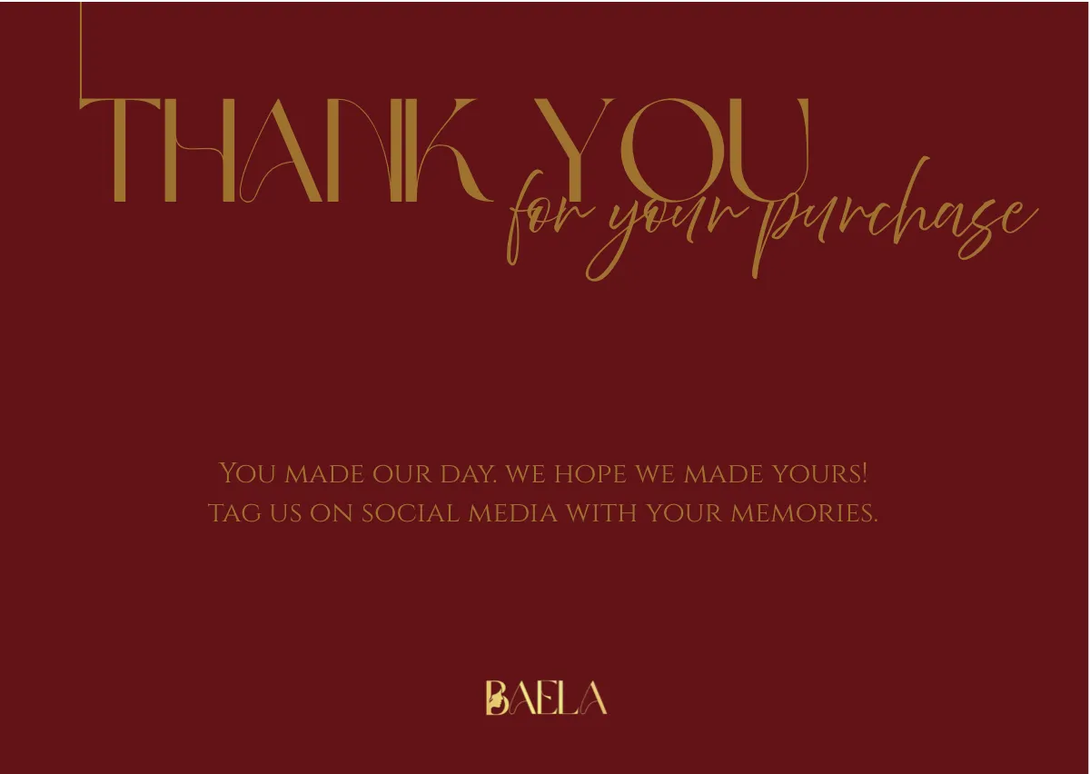
A packet, butter paper and a thank-you card, all in the same gold on deep red. The monogram tiles across the butter paper so an unboxing has something to look at before the piece is even out. The card asks for a tag rather than a review.